(PS - no idea why some of my text has a white BG - soz! 😢)
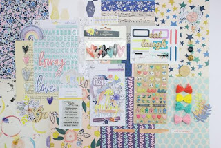
To recap, we are counterfeiting Citrus Twist's October 2018 Kit called "Little Things".
Challenge 2 is a sketch challenge appropriately also from Citrus Twists's blog.
The instructions for this sketch from Lisa are: "Place your own "twist" on it by rotating it, reversing, mirroring, turning it upside down, making it smaller or just doing your own "thing" to it - just don't use it as is!"
Naturally, this was one of the few sketches I liked as it was! Well with more layers and embellies, obvs!
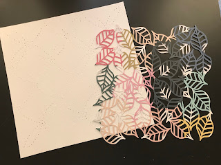 Anyway, since last month's forgery, I have been toying with ways of using a particular photo in such a way to keep as much of the background as possible showing.
 I had been stitching the gaps between the leaves (but more about that later!) and that allowed for thinking time. The only thing I had decided for (almost) certain is the photo.
The other cut file with the holes for hand stitching is for another day!
Upon seeing the sketch and having to twist it, changing two almost square photos to one landscape is a pretty obvious change. 😎
I also visualized it with a phrase or image card rather than journaling card.
The cameras I cut from one of the papers in my kit isn't really a card, but the story here is about photography and the taking of this particular photo so the motif was repeated.
To me, using a detailed background is also a change even though the sketch doesn't specify. It just seemed to me like a really minimalist design and the virtual absence of embellies (aside from causing me to hyperventilate) seemed to confirm that.
I printed the photo smaller than 4x6 to leave as much space as possible. I didn't use the paper strip across the top of the sketch and shifted the block with the paper layers, photo and 3x4 card up a bit higher.
As soon as I had placed the block, I decided I wanted a smaller one at the bottom (natch). If for no other reason than to have a place for more embellies! 🙈
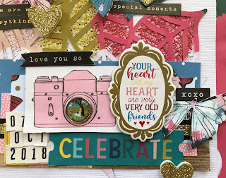 I really wanted to mix in some of the Alice papers and embellies without being too obvious since it wasn't actually inside the exhibition, but I wanted the continuity since this layout and another at the same location form part of the story about what we did for our anniversary.
There are more structural changes, but I think it's time we went back to THAT cut file and background.
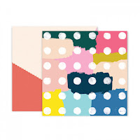
Like I mentioned last month, (and the one before) I was mixing up Autumn in the inspiration kits with it being Spring in the Southern Hemisphere. In this case, it's a leaf cut file by Paige Evans which I cut using Paper 5 from Paige's Pick Me Up Collection wirh Pink Paislee. The paper seemed to be quite springlike in colour!
After cutting it, I put a pencil into the pen holder of the Silhouette and drew it onto white cardstock.
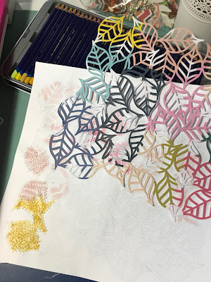 At some point it occurred to me that messy stitching in the open areas using a similarly coloured thread would look pretty cool since I love texture as well as colour. I only did once section before I knew I had to come up with an idea to make the changes from one colour to the next easier to see...and white gaps between the coloured thread looked stupid.
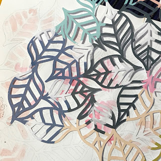
I reached for the nearest watercolour set and lightly went over each section in the relevant colour. This was especially useful when part of one leave changes colour or has a white section from the polka dot.
A wider zig-zag stitch made it easier to go in all directions which looked better. Once I was done, the white dots looked weird and unfinished so I had to go back and do those too.
I wanted a coloured border behind the white background, and the remainder of the patterned paper after cutting the designed could be matted onto an ugly sheet of cardstock and had enough all the way around for a reasonable border. It looks pretty cool after placing the leaf cut in the same orientation!
Since this is one layout of many of a particular event, I could get away with keeping the journaling short and telling more of the story on the facing page.
With the title split above and below the photo, I felt/hoped it looked balanced enough and added the date to the strips of paper at the bottom since that's a pretty important part of the story too!
Early on, I decided butterflies were a must. Like leaves they ad little to do with the story (at least not this part of it), but I do consider them a fdairly generic motif and I had the aptly named "Monarch" paper from Maggie Holmes Chasing Dreams in my kit begging to be fussy cut! I did the same with the cameras from "Memories" (also from Chasing Deams),
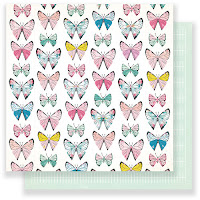

An initial thought of a diagonal sprinkle of butterflies turned into scattering them about the leaves which looks kinda ok! After adding a few more black work stickers I figured I might as well add one to each butterfly because more is more, right?
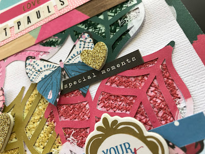
Some of the brads from the Alice in Wonderland collection had teeny tiny scenes and to me putting them into the lenses of the cameras made me think of the photos we took at the exhibition in a trippy ViewmasterXCanon hybrid type thing. The one below has a clock. And I added a rabbit. See what I did there? 😜
Not being able to find my Heidi Shine meant I took it out on those poor glittery hearts from the Willow Thickers sheet. (soz!)
Ohh you want to see the whole layout, right? OK well here it is! Another exercise in how-much-can-you-cram-onto-one-page-and-still-gaze-wistfully-at-all-the-other-stuff-you-still-wanted-to-use.
Selfie...@ St Paul's
I
think I even managed to position everything that at ;east a teeny tiny
bit of each leaf colour can be seen. It was a bit hard to cover the
stitching after the physical and emotional pain it caused, but I think
the end result is worth it!
See,
that's one thing that really hit home during the making of this
layout. I don't have an issue with scrapbooking less than technically
perfect photos. If they tell the story then that's all that matters.
I
also am finding that while I am throwing in a layout that uses mixed
media or cut files or some other special technique more often, I
normally save it for "special" photos. Yeah my first thought is
special occasions or maybe the artsy ones NotPinkCraftyHubster takes.
 Yet
somehow THIS photo ended up getting the special treatment and it
doesn't fall into either category. It's not a super special occasion
like a wedding, but it was a special day in itself. But this
photo...firstly I don't look completely heinous so tat's always a plus,
😂 but it has all three of us which we have very few photos.
And
rather unexpectedly we realized that the location of the exhibition was
eight across from St Paul's Cathedral where out wedding photographer
took us when we had a pre-wedding photo shoot.
So
the moral of the story is to see the value in those less-than-perfect
snaps, because they may b more precious than you first realize!
Oh and one last thing...
Yeah he puts the "KIT" in kitty cat. Just wish he wouldn't always try to sit on it (or in it n this case)
Love and stitchy sketches!


Super cute layout! Love all the gorgeous leaves! Your kitty is so adorable!
ReplyDeleteWow, what a lot of work. It looks amazing. I love how you over embellish (I do this all the time, it's the love of the process), it makes my heart sing, must be an Australian thing.
ReplyDeleteWOW-mazing, Alex!!!! You are still reigning supreme as the Lots of Layering Queen!!!! WOW!!! I'm glad you wrote about the cute picture brads used in the lens area of the cameras! Super clever!!! I might not have noticed them until the 3rd or 4th time of looking at your layout. Today my eye seems to be drawn to the leaves, butterflies, and scattered text uses. Terrific sketch interpretation for CKC blog challenge #2!!!!
ReplyDeleteits so nice!
ReplyDeletecat is so cute sleeping in the box!
Oh this background is amazing. It took so much work and thought. Perfect!
ReplyDelete