28 November, 2018

Layout 4 using November CKC kit

TEN DAYS?  😱😱😱

It's been ten days and I've only just made another layout with my November Counterfeit Kit Challenge kit. 

The day after Challenge 2 went up on my blog (and the CKC blog because I'm guest designer for November) I go in for my 8 weekly infusion to keep old Arthur* at arms length and what happens?


NOTHING!  (During the infusion itself, that is!) Afterwards, all hell broke loose, though!

Rarely do I get a nice straightforward one with no reactions or complications, buuut the aftermath!  It's normal for most people to get some kind of post-infusion "hangover" and it has varied in severity from infusion to infusion over the years, but this week was worse than it has been in a very long time.  And if that's not enough, lets add all the weather changes the Spring brings and the barometric pressure changes have been kicking my butt! 🤕🤕🤕

After a week of such nonsense I was determined not to let my one day without having to do the school run go to waste,  I wasn't feeling it, but forged on ahead.  That was my first mistake.  With many jobs, fatigue, pain or lack of inspiration wont have any adverse affect on result or performance.  Creative work isn't one of those things!

I managed to dislike how much I cut back my background paper and how it looked with the border, so fortunately I had one last piece in my stash I could cut into. 

This paper is from Shimelle's True Stories collection (aptly named Blueberry Muffin) and is filled with text from Alice in Wonderland, so how perfect to use for the cover page to the section in my album about our visit to the exhibition.  I think I have used it three times by now, and used the B-side two out of those three times!!

I may have to hunt down more somewhere!

The biggest die cut looked good against it, but the cursive text needed some definition.  I couldn't find the open toe foot to my paper sewing machine, but chose to proceed without it (hint - DON'T DO IT!!).  

Messyish, but not TOO bad.

I know!! 💡💡💡 It would look better if I hand-stitched over the top (NO!).

Yes it probably would except all the machine sewing caused the paper to be weak and unable to support the hand stitching,

If I had an extra bit of background paper I would have started again.  New cut file and everything.

I guess one advantage of having a chronic illness is persevering in adversity.  💪💪💪 The quote in the cut file also kept this in my head and I re-cut just the text part of the cut file a second time on the Silhouette to stick over the top.

Not having been drawn together with dense sewing, the new cut was a little bigger despite having the same dimensions as the original.  I made do and got it as right as I could.  Still, plenty of scars of past disasters peek through the text.  I don't mind...much.  I was determined to finish this page and  enjoy the memories of the outing which was really special.

I was planning to use some of the florals from embellies from the Echo Park Alice in Wonderland collection along with some from Paige Evans' Pick Me Up.  Colours and style go together much better than I thought!

The basic layout of the page draws some inspiration from this layout by Paige Evans.  My cut file and photo are smaller leaving more room for "stuff"

The placement of the subtitle and photo were not my first choices.  Placing the photo anywhere on the left side of the cut file would have obscured the small detail of the advertisement of the exhibition on the front of the building (bottom right of the photo).  I can't exactly remember, but it may have been moving light so Hubz did a good job catching it.

I thought the slightly artsy and fairly plain photo of the building before we went in was just right for a cover page. The more detailed the die cut, the more challenging to bring together without them elbowing each other in the face for attention.

The sharper than usual angle of the photo position seemed to only work if I made it look like it was fastened with something so enter the paperclip.  The brads helped bring in more metallic texture to make it a bit more balanced.  Along with the gems in Alice Blue, some hide boo-boos and some don't! 😉

Not every rogue thread and stitch hole was covered over, but most were.  Any more and it started looking over-worked (I know because I tried!)...and it has to be bad if the Queen of More starts pulling things off (with their heads!) (see what I did there? 😂)


The small amount of journaling seemed to work well on the teapot.  Alice's name even shows up in two spots on the paper and I took great pains to keep it so.  It's fairly obvious at the top here.

The other one is at the bottom.  Can you find it?

Overall, I'm happy enough especially considering what it was!

I still have plenty of Alice layouts as well as ones from the High Tea to scrapbook with this kit, so I'm not shelving it just yet.

I'm also still re-working October's kit and turning it into a mainly Autumnal, but also colours-and-stuff-that-does-get-enough-love kit (pretty much anything that isn't pink or aqua! 😝) so I'll get those kits sorted in December.

I'm also going yo use a really special kit I made together with a scrappy friend from another hemisphere to document photos of when we met each other earlier this year so it's definitely worth sticking around for that!

What?  Ohhh you want to see the whole layout.  Hmm...be careful what you wish for, but OK then!

This is Impossible Only if You Think it is 

Alice in Wonderland Comes to ACMI


*⬅ Acronyms in left sidebar

Love, and remember that sometimes more is more!


18 November, 2018

CKC November Challenge 2

Today the second and final official challenge for the November Counterfeit Kit Challenge and I'm the guest designer for this month too!  Still can't quite believe it TBH!

(PS - no idea why some of my text has a white BG - soz! 😢)

To recap, we are counterfeiting Citrus Twist's October 2018 Kit called "Little Things".


Challenge 2 is a sketch challenge appropriately also from Citrus Twists's blog.


The instructions for this sketch from Lisa are: "Place your own "twist" on it by rotating it, reversing, mirroring, turning it upside down, making it smaller or just doing your own "thing" to it - just don't use it as is!"

Naturally, this was one of the few sketches I liked as it was!  Well with more layers and embellies, obvs!

Anyway, since last month's forgery, I have been toying with ways of using a particular photo in such a way to keep as much of the background as possible showing.   

I had been stitching the gaps between the leaves (but more about that later!) and that allowed for thinking time.  The only thing I had decided for (almost) certain is the photo.  

The other cut file with the holes for hand stitching is for another day!


Upon seeing the sketch and having to twist it, changing two almost square photos to one landscape is a pretty obvious change.  😎

I also visualized it with a phrase or image card rather than journaling card.  

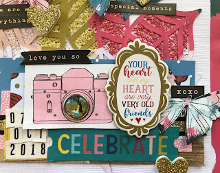
The cameras I cut from one of the papers in my kit isn't really a card, but the story here is about photography and the taking of this particular photo so the motif was repeated.

To me, using a detailed background is also a change even though the sketch doesn't specify.  It just seemed to me like a really minimalist design and the virtual absence of embellies (aside from causing me to hyperventilate) seemed to confirm that. 

I printed the photo smaller than 4x6 to leave as much space as possible.  I didn't use the paper strip across the top of the sketch and shifted the block with the paper layers, photo and 3x4 card up a bit higher.  

As soon as I had placed the block, I decided I wanted a smaller one at the bottom (natch).  If for no other reason than to have a place for more embellies! 🙈

I really wanted to mix in some of the Alice papers and embellies without being too obvious since it wasn't actually inside the exhibition, but I wanted the continuity since this layout and another at the same location form part of the story about what we did for our anniversary.

There are more structural changes, but I think it's time we went back to THAT cut file and background.  

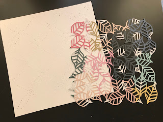
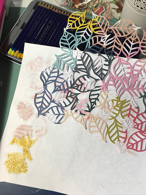
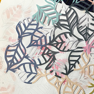
Like I mentioned last month, (and the one before) I was mixing up Autumn in the inspiration kits with it being Spring in the Southern Hemisphere.  In this case, it's a leaf cut file by Paige Evans which I cut using Paper 5 from Paige's Pick Me Up Collection wirh Pink Paislee.  The paper seemed to be quite springlike in colour!
 
After cutting it, I put a pencil into the pen holder of the Silhouette and drew it onto white cardstock.  

At some point it occurred to me that messy stitching in the open areas using a similarly coloured thread would look pretty cool since I love texture as well as colour. I only did once section before I knew I had to come up with an idea to make the changes from one colour to the next easier to see...and white gaps between the coloured thread looked stupid.


I reached for the nearest watercolour set and lightly went over each section in the relevant colour.  This was especially useful when part of one leave changes colour or has a white section from the polka dot.


A wider zig-zag stitch made it easier to go in all directions which looked better.  Once I was done, the white dots looked weird and unfinished so I had to go back and do those too.

I wanted a coloured border behind the white background, and the remainder of the patterned paper after cutting the designed could be matted onto an ugly sheet of cardstock and had enough all the way around for a reasonable border.  It looks pretty cool after placing the leaf cut in the same orientation!


Since this is one layout of many of a particular event, I could get away with keeping the journaling short and telling more of the story on the facing page.

With the title split above and below the photo, I felt/hoped it looked balanced enough and added the date to the strips of paper at the bottom since that's a pretty important part of the story too! 


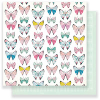
Early on, I decided butterflies were a must.  Like leaves they ad little to do with the story (at least not this part of it), but I do consider them a fdairly generic motif and I had the aptly named "Monarch" paper from Maggie Holmes Chasing Dreams in my kit begging to be fussy cut!  I did the same with the cameras from "Memories" (also from Chasing Deams),


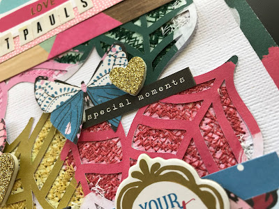
An initial thought of a diagonal sprinkle of butterflies turned into scattering them about the leaves which looks kinda ok!  After adding a few more black work stickers I figured I might as well add one to each butterfly because more is more, right?


Some of the brads from the Alice in Wonderland collection had teeny tiny scenes and to me putting them into the lenses of the cameras made me think of the photos we took at the exhibition in a trippy ViewmasterXCanon hybrid type thing.  The one below has a clock.  And I added a rabbit.  See what I did there?  😜


Not being able to find my Heidi Shine meant I took it out on those poor glittery hearts from the Willow Thickers sheet. (soz!)


Ohh you want to see the whole layout, right?  OK well here it is!  Another exercise in how-much-can-you-cram-onto-one-page-and-still-gaze-wistfully-at-all-the-other-stuff-you-still-wanted-to-use.


Selfie...@ St Paul's


I think I even managed to position everything that at ;east a teeny tiny bit of each leaf colour can be seen.  It was a bit hard to cover the stitching after the physical and emotional pain it caused, but I think the end result is worth it!

See, that's one thing that really hit home during the making of this layout.  I don't have an issue with scrapbooking less than technically perfect photos.  If they tell the story then that's all that matters.

I also am finding that while I am throwing in a layout that uses mixed media or cut files or some other special technique more often, I normally save it for "special" photos.  Yeah my first thought is special occasions or maybe the artsy ones NotPinkCraftyHubster takes.

Yet somehow THIS photo ended up getting the special treatment and it doesn't fall into either category.  It's not a super special occasion like a wedding, but it was a special day in itself.  But this photo...firstly I don't look completely heinous so tat's always a plus, 😂 but it has all three of us which we have very few photos. 
And rather unexpectedly we realized that the location of the exhibition was eight across from St Paul's Cathedral where out wedding photographer took us when we had a pre-wedding photo shoot.


So the moral of the story is to see the value in those less-than-perfect snaps, because they may b more precious than you first realize!

Oh and one last thing...


Yeah he puts the "KIT" in kitty cat.  Just wish he wouldn't always try to sit on it (or in it n this case)


Love and stitchy sketches!


12 November, 2018

CKC Challenge 1 and Layering with Shimelle

Challenge 1 of the month over at Counterfeit Kit Challenge, and oh boy did this one roll around unexpectedly.  😲😲😲  OK that's not entirely true...

 
I knew it needed to be done by TODAY, it's just that today was TODAY that surprised me.  One minute it's Last Week and then yesterday I glance at the date on my phone and panic ensues.


Fortunately I've had ideas about this challenge turning over in my head since we got the brief.  The challenge is called "Sprinkle and Sparkle".  Lisa says: "there's always a sprinkle of shimmer, confetti, sequins or glitter to be seen.  Make sure you make your own project shine this celebratory month by adding some extra sparkle".  November is Lisa's birthday month and while I don't celebrate birthdays, I very much love all things glittery!

THIS was the right challenge for a particular story about my little nieces and and my older niece's very VERY sparkly and blingy clothing choices when they went on an outing with their other aunt and their cousin (the one and only SmallCraftyDude)!

I had paper in my kit for November that would work in terms of colour, but I did have to "borrow" some embellishments from Shimelle's various collections which have plenty of glittery and sparkly words!

These very words were the next layer in Lisa's challenge:


Are these not the most perfect words for a layout on this topic? (the "Shine" one was from the Alice in Wonderland chipboard sheets from the kit and the rest were die cuts and cut aparts from various Shimelle collections over the years.

My favourite has to be "Try a smidgen of Bling".  The story makes it quite clear that Miss L tried a heck of a lot more than just a smidgen and we love her for it! 😘😘😘


As I was pondering how to actually arrange the photos on paper, I looked through the prompts in Shimelle's Layer on Layer on Layer class which I have been working through, and found Prompt 21 to be perfect!

The focal point of each embellishment cluster was a cut file which gets backed with patterned paper and repeated in each area in a different size.


I was about to "settle" for a typical heart shape (and I have plenty that fit the bill) when I remembered  have several gemstone shaped cut files by Paige Evans (there's that brief again!) that give the cut frame and you back them onto something else.  There are sooo many cool things I could do with them! 🤔


One of last month's forgeries got tinkered with again and cut out areas got backed with glitter paper. ooooh!  😍😍😍

I could totally do that...OR...make shaker pockets stuffed full of all kinds of sparkly bits.  I didn't add any glitter because the static makes it stick to the plastic and you can't see anything else in there so I just used lots of iridescent spangles.


More about that later. Anyway it turns out I found the nib I was missing to my WeRMK Fast Fuse tool.   Where was that 2 weeks ago?? 🙄 It's the one for cutting not fusing anyway, so didn't stop me from getting out a page protector design that I rarely use and sacrificed it for the greater glittery good.


The hole left behind by in the cardstock after the shape was cut out worked well as a template to know where to fuse the shape.  I wanted to leave one small section open into which I'd put in the glitter (or in this case spangle mix).  Mix??  I guess I'd better get onto it then!

I used hollow and solid hearts and stars and flowers and squares and circles.  I tried to mostly stick to white or translucent, but I bit of gold and pinks, blues and purples went in as well.  Gold might seem like an odd choice, but it was a pretty important element in the story. 😉

 
Stuffing it to just the right volume is a bit of an art.  If I were making a card, I'd definitely leave enough empty room to make it shake, but on a layout where gravity will settle it (possible at the bottom if the album is stored upright), much of the sparkle may be hidden by embellies placed on top.  I guess shaker pockets are a bit of a misnomer in this case.

 
After fusing the pocket closed, there will be a little discrepancy between the cardstock shape and pocket.  Some parts will have embellishment on top, but if you don't like it, cut it back and re-fuse from behind.

I am pleased to report that I didn't even cheat with any of the papers (well except for the large mat behind the photos).  It's because I wanted something with contrast that also brought in the yellow green and purple from the border around the background and I also wanted to be able to bring those colours in though the embellishments...and to break up all the pink and blue.

The basic construction was pretty quick.  Picking out and positioning all the little bits took a lot longer.  Possibly even longer than those glitter pockets since much time was spent putting things on and pulling them off! 😂


Finding the right alphas for the title was a struggle.  The gold were from the kit, but had to bring in the blue since not of the others (not even the "messed up ones")  looked just right.  They don't look nearly as "wobbly" in real life!  I put pop dots of various heights under the last two letters of "girls" to get them to the same height.


The journaling was straightforward enough...if you consider the fact I needed a journaling card (actually another cheat there since I used Shimelle's writing pad from Box of Crayons) that fit in the space, looked OK AND gave me enough room for my story. 🙈


Here it is if you want to read it, since it isn't entirely obvious from the pictures.  Pics should be larger if you click on them.

Here is the full layout.  Have you noticed anything DIFFERENT popping up in the embellishment clusters that didn't show up on the CKC blog?  It's not the copious gold mist or little blue gems from the pack of messed-up-enamel-dots that are fair game.

Here is the full layout and look again.

Juicy Girls


So, I was all done and rummaging around while waiting for the pics to sync from my phone onto my Mac.  Then I found THIS.


The clear ones are pretty much identical to the bling on L's tracksuit! 😂😂😂

There was nothing to be done, but re-work the embellishment clusters and re-do the photos for the blog.  Yes there was already too much there, but more is more and I actually like it better now!

In terms of the brief I managed to sneak some sparkle into:
  • The topic of the layout and photos
  •  Sparkle themed word embellies
  • gemstone shaped cut files
  • filling cut files with spangles
  • gold glitter thickers (alphas and star shapes)
  • gold mist drops
  • flat gold stars
  • chipboard stars and gems
  • stars on pattern paper and die cuts
  • blue and clear gems
Seems excessive, right?  In that case I consider this mission accomplished!


Please also visit the other ladies who are also presenting their take on this fabulous design brief.  I'm really excited to see what they (and YOU) make.  If you take part, please don't forget to link up your project here on the monthly CKC link up page.

Thanks so much for stopping by!

Love and Sparkly Shenanigans!

08 November, 2018

NEW winner for Cat Lovers Hop 2018

Hello Cat Loving friends.

Did you happen to enter my prize giveaway for the Cat Lovers Hop 2018?

For this prize?


Well the first winner was drawn on Sunday.  She was supposed to contact me within 48 hours and when that didn't happen, I had to go looking for her.

Please let this be a gentle reminder to check that the email address you use with your blogger account still works!  I managed to send a message, but still no response (4 days in total) we decided the fair thing to do was a re-draw. 

(We specified in the rules it would happen after 48 hours anyway) 

The two embellishment prize winners are fine and I'll have your prizes out to you asap!

So I had to enlist the assistance of my SmallCraftyHelper and we did another draw

Spoiler below:


  •  
  •  
  •  
  •  
  •  
  •  
  •  
  •  
  •  
  •  
  •  
  •  
  •  
  •  
  •  
  •  
  •  
  •  
  •  
  •  
  •  
  •  

And the NEW WINNER of the cat stamp set is:


Arianna Barbara

Congratulations and please email me at alex@pinkcraftymama.com or PM via Facebook or whatever in 48 hours to claim your prize!


Love and catty cuddles,


06 November, 2018

CKC November Mini Kit and Layout AND Layering With Shimelle

I know what you're thinking and you can stop laughing!  Right now! 😂


I am TOTALLY capable of pulling together a mini kit! 😛 Yes it's 6th of the month and that means it's mini kit day over on Counterfeit Kit Challenge blog where I am guest designer for November.

My choice was simple - since we were using Citrus Twist's "Little Things" for the main kit, it made sense to choose the co-ordinating "Little Things" Pocket Life kit to base my mini kit on.  I was subscribed to both kits about 5 years ago.  Admittedly they are different now - they seem a little smaller than they used to be, but I also think that reflects the more minimalist style so often seen these days.


My cunning plan was to then be able to incorporate the mini kit my main kit...but not before I was required to MAKE a PROJECT with the mini kit.  Say whaaat??

Boy, I did NOT think this through!

But first let me take you through the kit.  I'm actually rather proud of the way I stuck to the limitations!

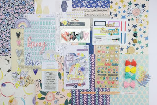
Here is what the original kit contains, and what I substituted each item with (mine is in green)

Pattern Paper
  • Exclusive 6" x 8" Pattern Paper, 12 single-sided sheets (Citrus Twist)
    12 pieces of scrap paper from my scrap box


Embellishments

  • Exclusive Twilight Blue Puffy Alphabet Stickers (Citrus Twist)
  • Paige Evans Pick Me Up Thickers
  • Exclusive Puffy Stickers (Citrus Twist)
  • Alice in Wonderland Sticker sheet by Echo Park
  • Exclusive Die-Cut Cardstock Ephemera (Kaitlin Sheaffer for Citrus Twist)
  • Admittedly large selection of die cuts (mainly pulled from last month's kit.  Bonus points for  recycling.
  • Exclusive Tiny Word Stickers with Gold Foil Words (Citrus Twist)
  • Maggie Holmes word stickers from Flourish
  • 2" x 3" High-Quality polymer stamp set (Citrus Twist)

  • My stamps are stored in DVD cases with as many sets as I can cram in and these Amy Tangerine sets have a good mix of both words and images.  
  • Twelve 3" x 4" double-sided journaling cards (Kaitlin Sheaffer for Citrus Twist Kits)
  • 6 3x4 cards from Paige Evans and 6 3x4 cards from Maggie Holmes
  • Two 4" x 6" double-sided journaling cards (Kaitlin Sheaffer for Citrus Twist)
  • 1 each of 4x6 cards from Paige Evans and Maggie Holmes
 
  • 7 Etched Wood Veneer Mini Hearts (Citrus Twist)
  •  Alice in Wonderland by EP decorative brads
  • Vintage Book Page (a flea market find)
  • Oops forgot to photograph, but it's there!
  • Cut apart Labels (Citrus Twist)
  •  "Festival" cut apart labels paper by Maggie Holmes from Carousel
  • Digital Printable cut apart Sheet, downloadable from our website under Shop, Digital Files (Citrus Twist)
  • "forgery" labels made on Silhouette and with stamps and manual die cutter 

Embellishment part of the Mini kit

Extras (because you knew knew had to be some (but only a few))
Amy Tangerine mini doilies (those things are tiny!)
Dear Lizzy enamel dots, wood buttons and "brads" (single embellishment sheet)
Mambi chips chipboard sticker booklet

So what's a girl to do when she doesn't have a single 12x12 inch paper for a background?

Three choices the way I see it:
  1. Make a pocket page or smaller project  It is after all, a pocket life kit
  2. cheat and grab a full sheet of patterned paper (or cardstock depending on level of guilt) for the background
  3.  Make franken-paper
 

Heir Comes the Bride


I decided to make franken-paper.  Of course I did.  I even took advantage of the branding strip to apply the adhesive to so I could maximize the paper (an entire half inch in this case! 😝)

Naturally AFTER deciding which event to scrapbook and (which photos to use), I realized that a facing pocket page would world really tell the story better.  😩

The photos on this layout look a bit crazy (they're of me cutting out masks for Prince Harry's wedding as fast as I could, but clearly not fast enough for my gorgeous nieces!).  Oh and I quite forgot to mention that I'm back going through Shimelle's Layer on Layer on Layer class.  

This is an untidier version of Prompt 18 and has lots of references to being crafty, although cutting out printable faces isn't exactly in the same league as painting the Mona Lisa, but still!!  I have more photos from this part of the night, and to make a layout for each is way too many, but if I put a good selection on a pocket page, I can do both!  

The same applies to the High Tea part of the night that my sister hosted.  So many beautiful photos of the table setting and food, but how much can you write about any one thing?  The solution would seem to be using the other side of the page protector for a second pocket page.

For now though, here are a few close up of the 12x12 page since it it looks kinda...well weird!


It feels like an eternity since I made a pocket page, so here goes!


I was happy with some of the pockets, but definitely not all of them.

I cut apart this pattern paper (a long time ago) from Shimelle's True stories collection and threw it in with my die cuts.  I further cut them apart and made cute little mini doily embellishments. 

The photos on the pocket page are definitely easier to identify than the other one.  My nieces loved those masks even though at 2 and 4 years old they had no idea who any of those people are!

It felt as though I spent 80% of my time hunting for (and losing) die cuts on my desk.  It's the down side to having so many I suppose, but I struggled as it is finding exactly what I wanted despite having plenty to choose from!  


Fortunately the word sticker sheet was really 4 sheets with some small alphas, although they wouldn't have been my first choice with this layout sit on that fine line between needing the variety a larger kit provides and the time saved by going straight to a kit rather than rummaging through my entire craft inventory.

Another advantage of gathering kits on a regular basis (even if you don't end up making a lot with them) is that you become more familiar with what you have.  The most obvious advantage is not doubling up when shopping, but finding just what you need is also more likely.


This is what both sides look like together,  The High Tea part of the story came first so it'll go on the other side of then pocket page protector with some kind of 12x12 to go with it.


 Heir Comes the Bride


That's all for now and please visit everyone else who has made a mini kit!

Love and mini kit mayhem,